Airbnb x Blue Apron

Feature Integration
ROLE
Concept
Research
UX/UI Design
Visual Design
Information Architecture
Prototyping/Animation
User Testing
STATUS
Academic / Conceptual

Elevating the short-term rental market with strategic product integration.

Many people choose short term rental platforms for their unique locations and amenities, but exotic destinations often have limited dining and grocery options. For many travelers, the kitchen is a critical factor for economy and convenience, but shopping for vacation is a chore that few enjoy.

This feature would integrate the ability to order one-off Blue Apron meal boxes for Airbnb stays right inside the Airbnb app.
ASSUMPTIONS

For this conceptual project, I specifically focused on the customer-facing interactions of Airbnb.

The host onboarding process would require a small expansion detailing kitchen accommodations.

I've assumed Blue Apron is willing to expand their business and create a funnel for new potential subscribers. There are many creative opportunities for Blue Apron to tailor specific programs and packages for Airbnb as we will later discover.

Research

Survey and Interviews

I surveyed over 20 people via Google Forms about their behavior and preferences surrounding Airbnb and familiarity with meal kit companies. Three in-depth personal interviews were a critical part of understanding people's true habits around traveling and cooking.

  • By far, the largest use case for short term rentals were vacations or getaways. (As opposed to business travel or unexpected stays.)
  • This is important because the purpose of travel provides a basis for behavior. On vacation, people desire an elevated sense of ease and indulgence.
  • Most people don't enjoy having to grocery shop for vacations, especially when traveling to remote or scenic destinations that may not have familiar accomodations.
  • The meal people tend to eat most often in Airbnbs is breakfast, but would be most interested in ordering dinner given the option.
View full results
Research

Personas

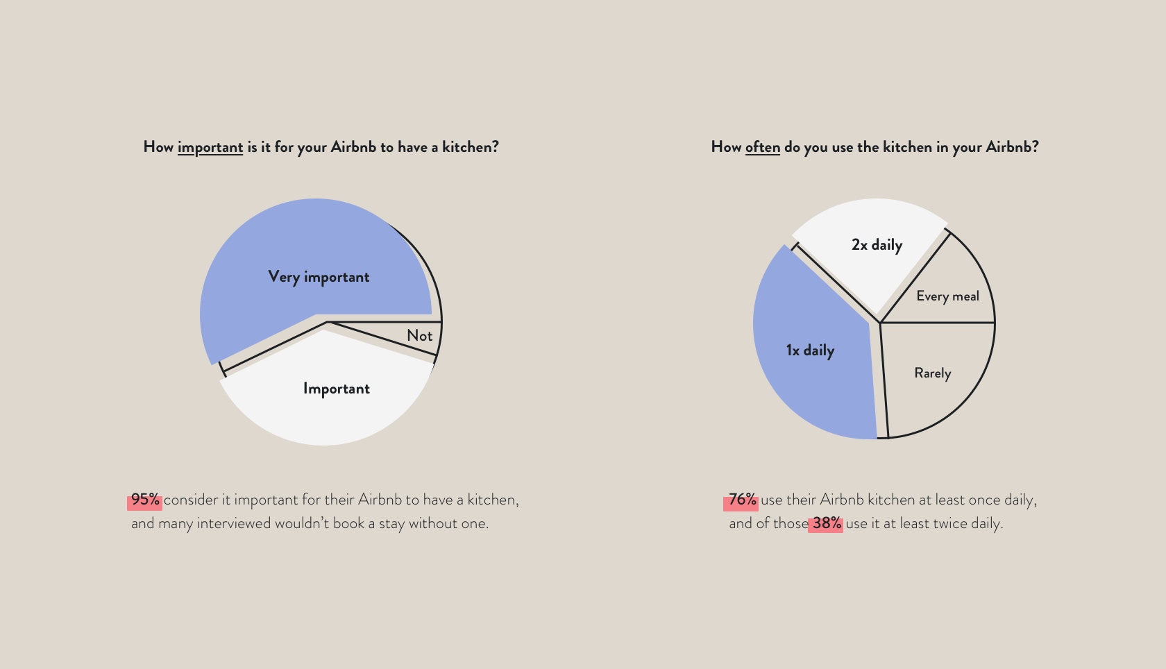
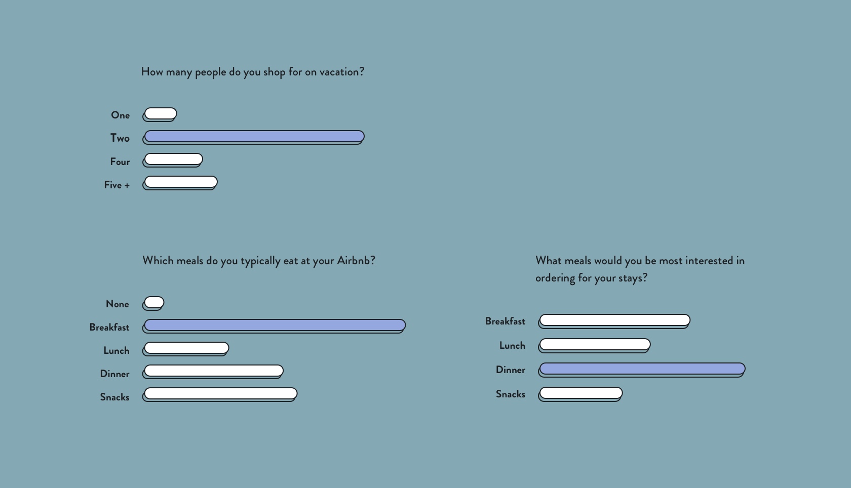
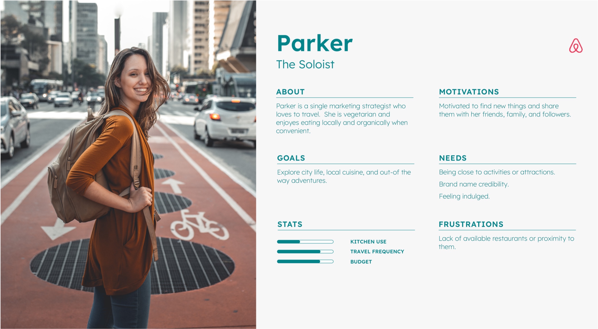
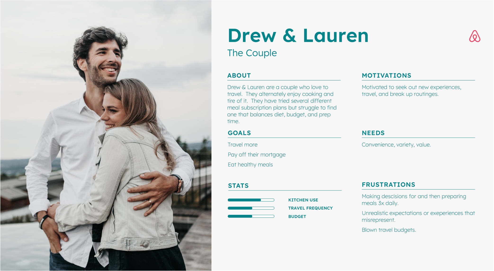
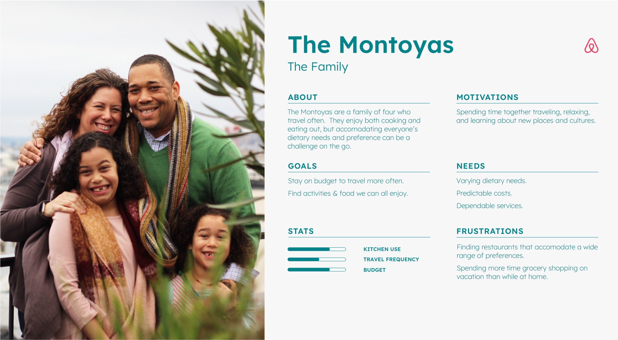
By carefully analyzing survey data and user behavior, I found you can ultimately segment the Airbnb user base into 3 categories:

  • Solo travelers
  • Couples
  • Families / Groups
Interaction

Flows

These flows detail the two key interactions of the project. My main goal was to preserve the feeling of both brands' established interaction patterns and expected behaviors.
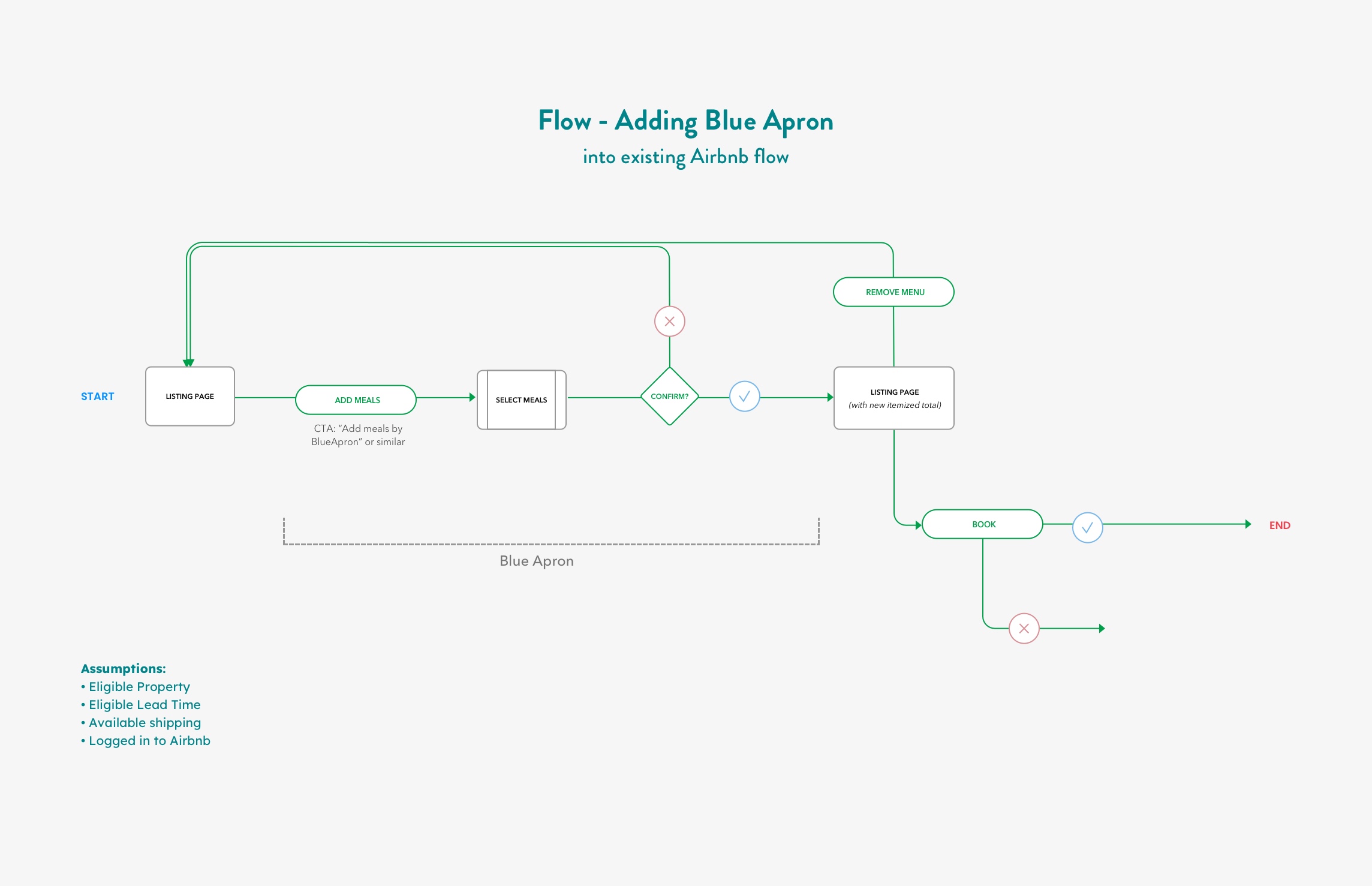
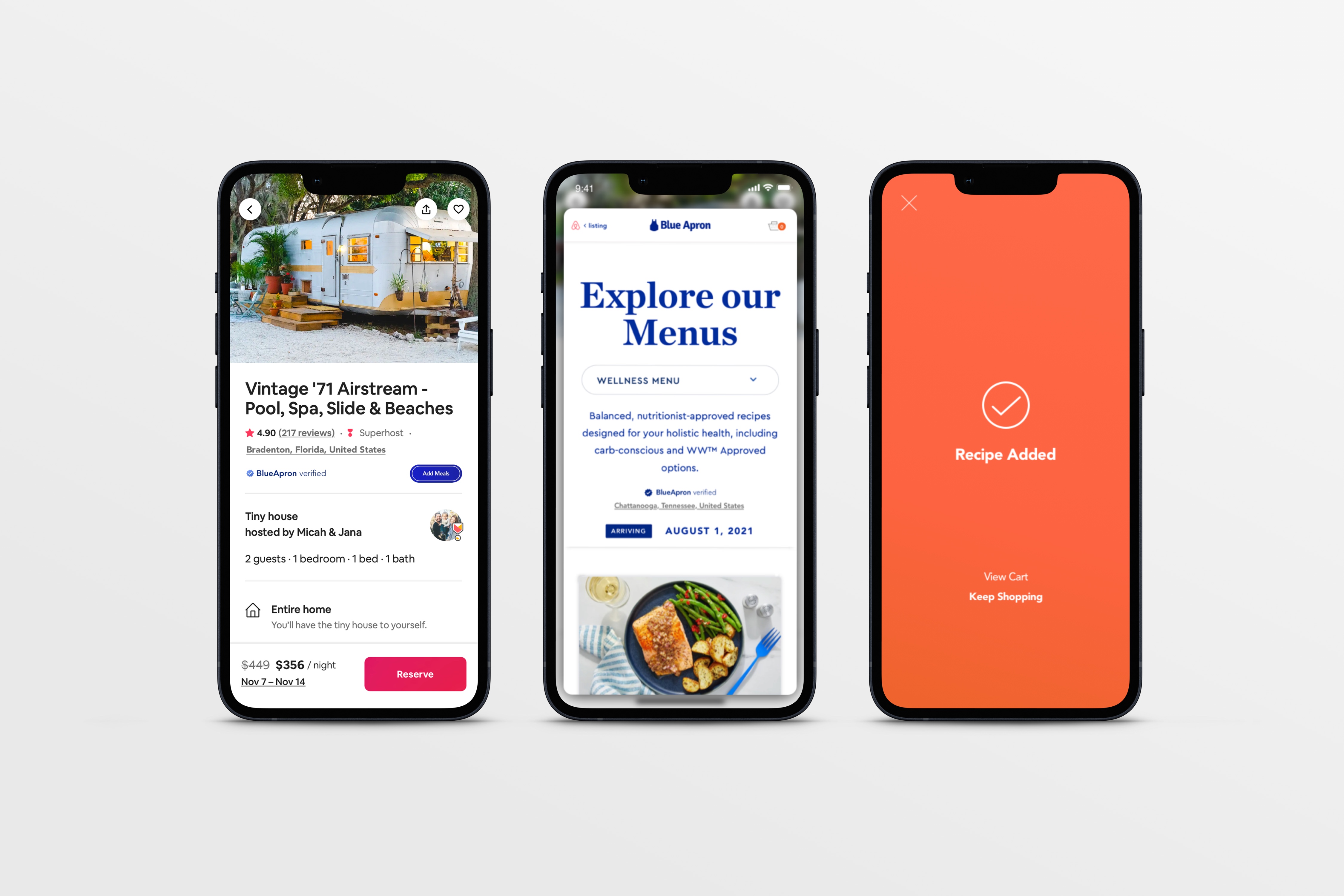
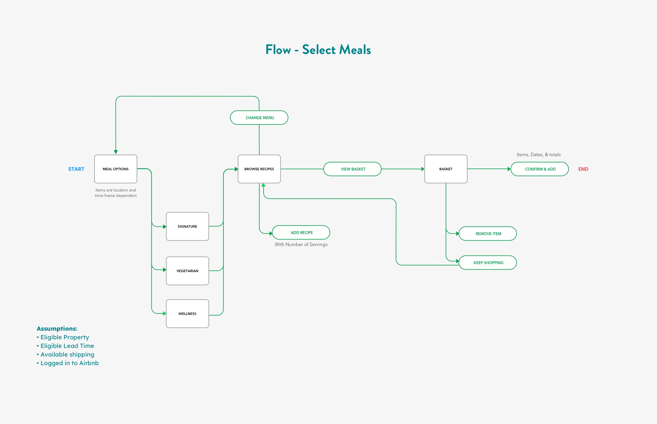
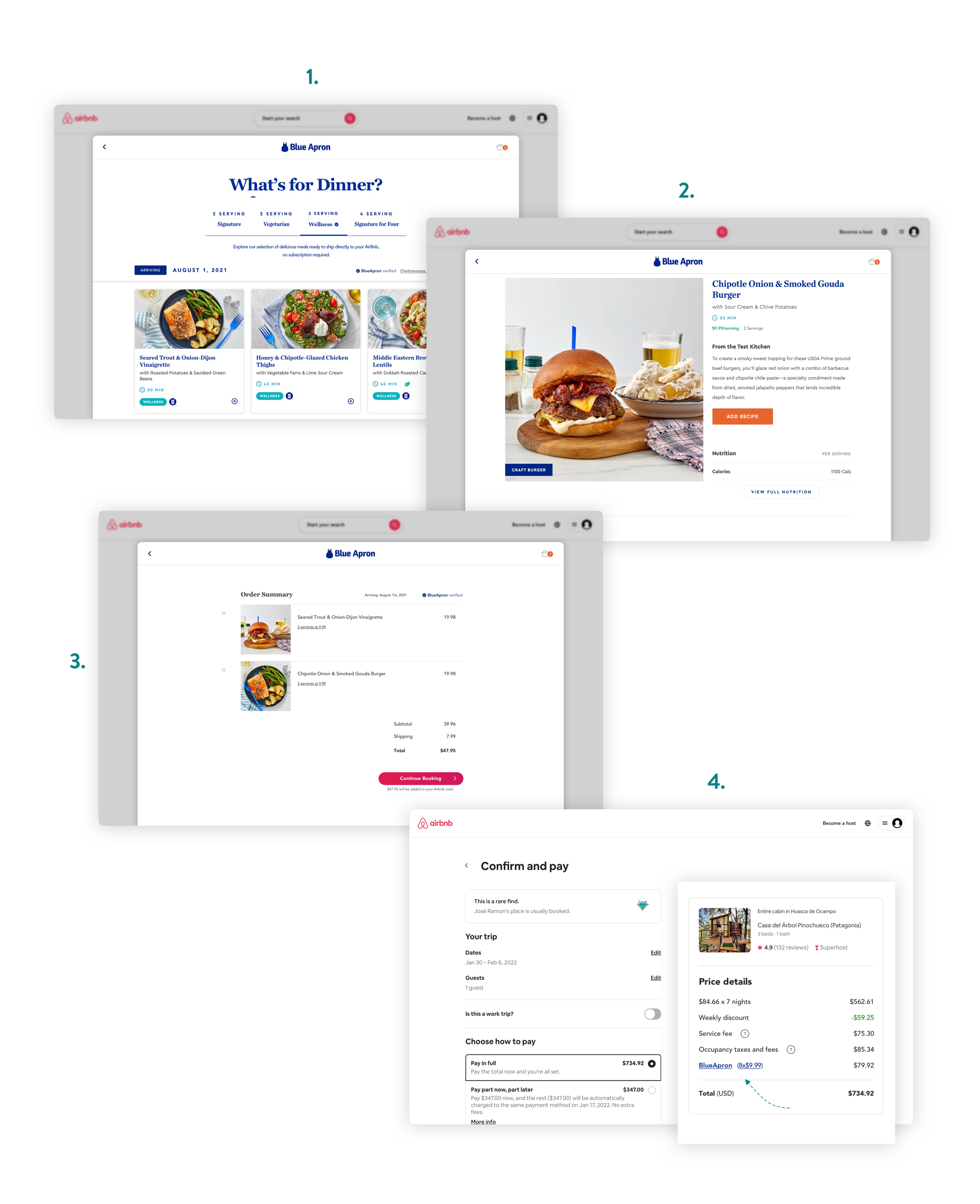
1.
Adding Blue Apron to Airbnb
I chose to insert the Blue Apron CTA beginning on the listing page of Airbnb. Typically at this point, a user has already entered their booking information and is ready to select a property and checkout. Since the listing page essentially acts as a product page I felt an addition here created maximum continuity with the existing Airbnb flow.

After selecting meals and finishing the "Add Blue Apron" process, the user can checkout directly or return to the listing page where a new itemized total will be displayed. Once selected, a meal package exists separate from a property listing and is automatically transferred between eligible properties until checkout, with the ability to modify items at any time.
Placement of Blue Apron in existing Airbnb flow.
2.

Selecting Meals
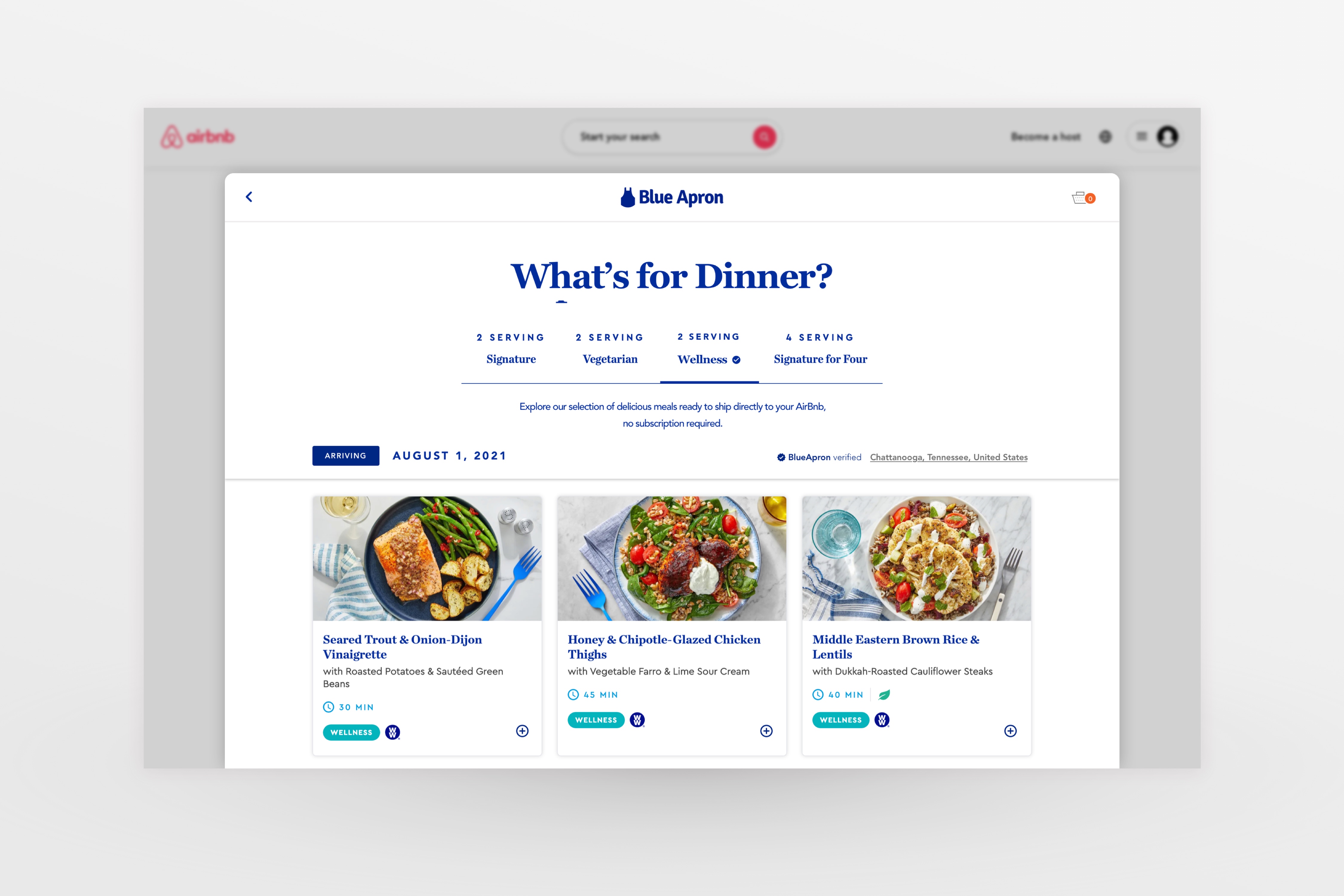
This further details the "Select Meals" section of the above flow and is adapted from the existing Blue Apron mobile flow. Users browse and add recipes to a basket, then confirm and add the order to their Airbnb total.
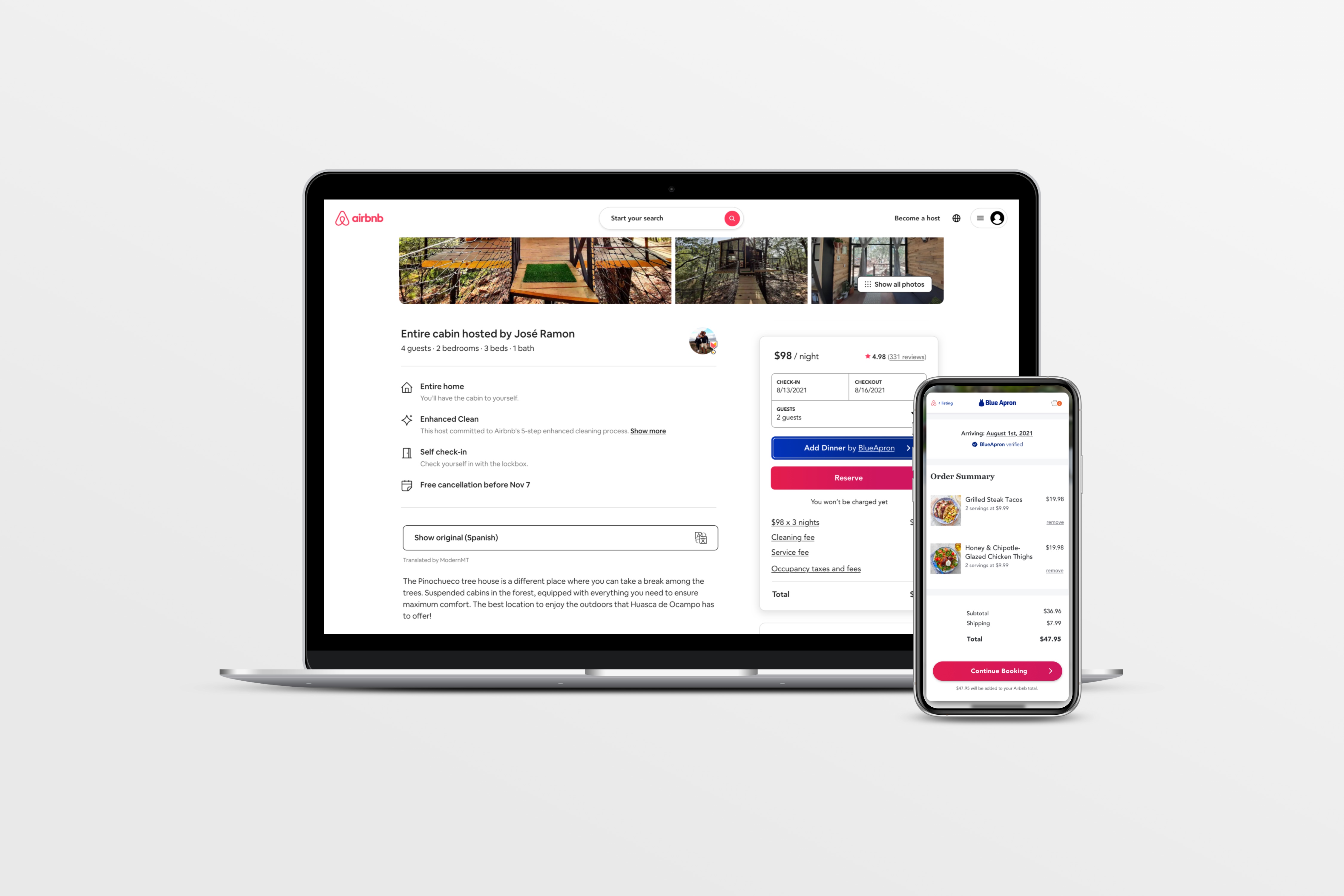
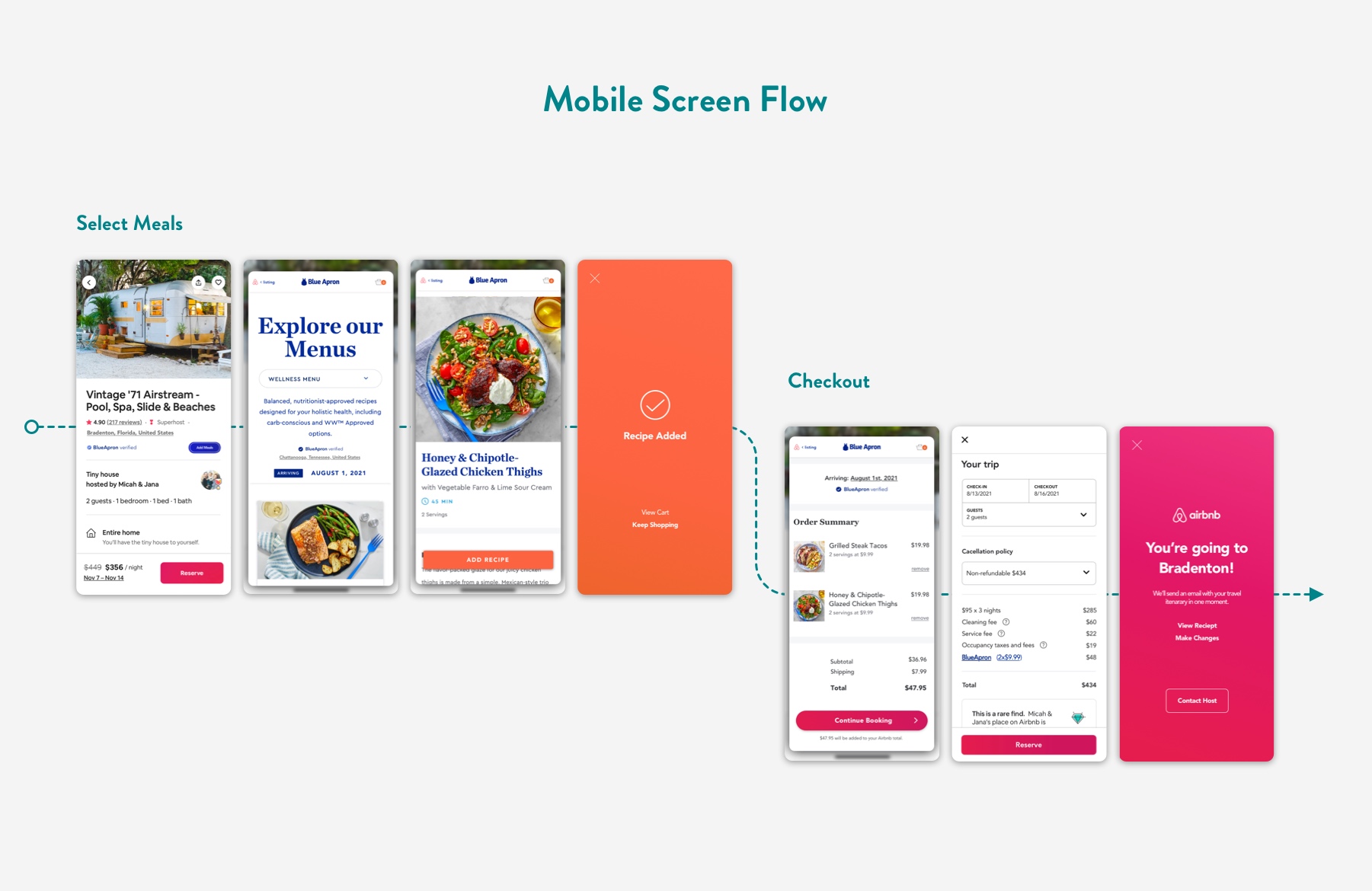
Detailing the meal selection process, based on existing Blue Apron mobile.
3.

Screen Flow
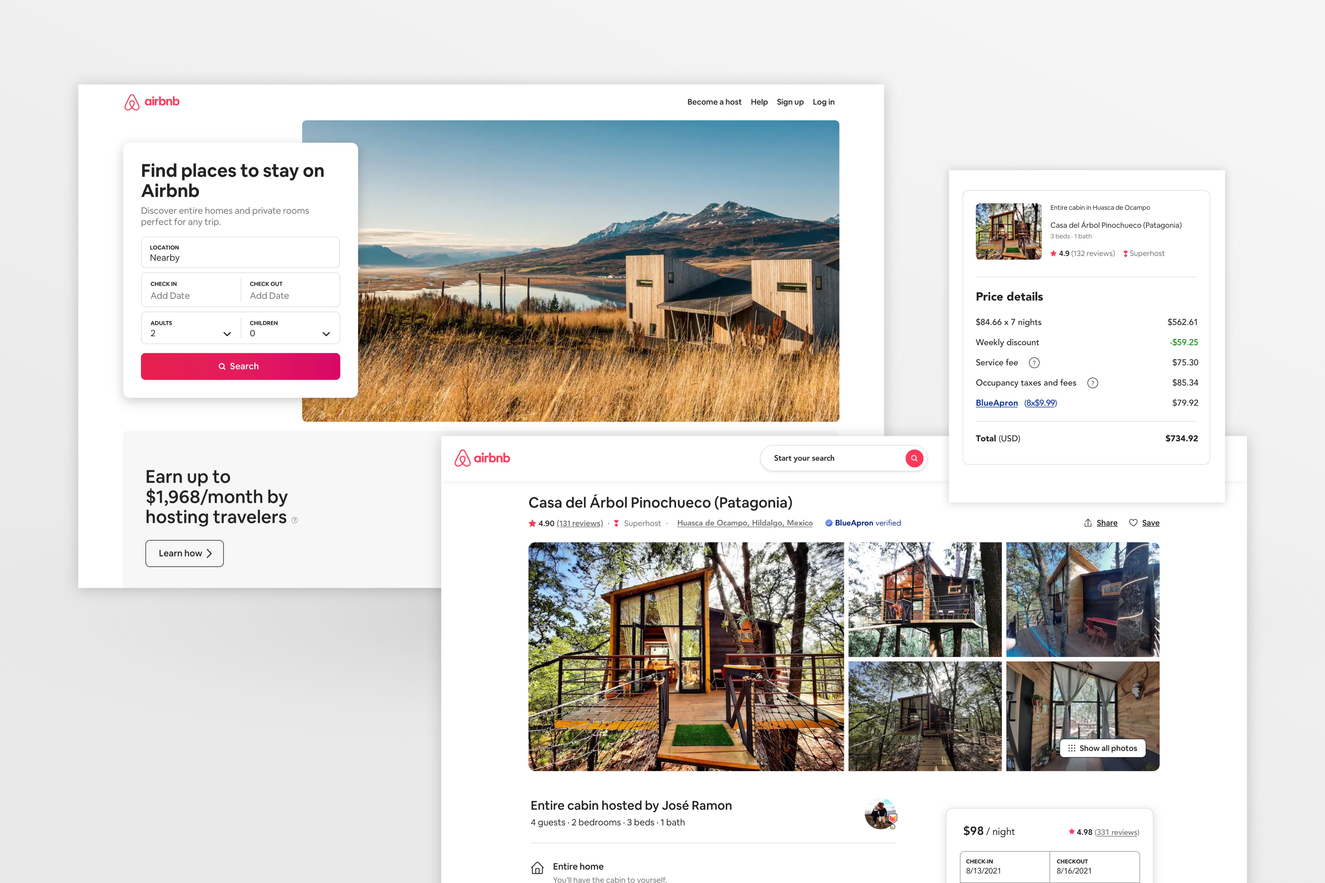
This diagram illustrates the user's journey through the previous two flows from listing page through checkout.

Illustration of the mobile flow
Visual DESIGN

Seamless Integration

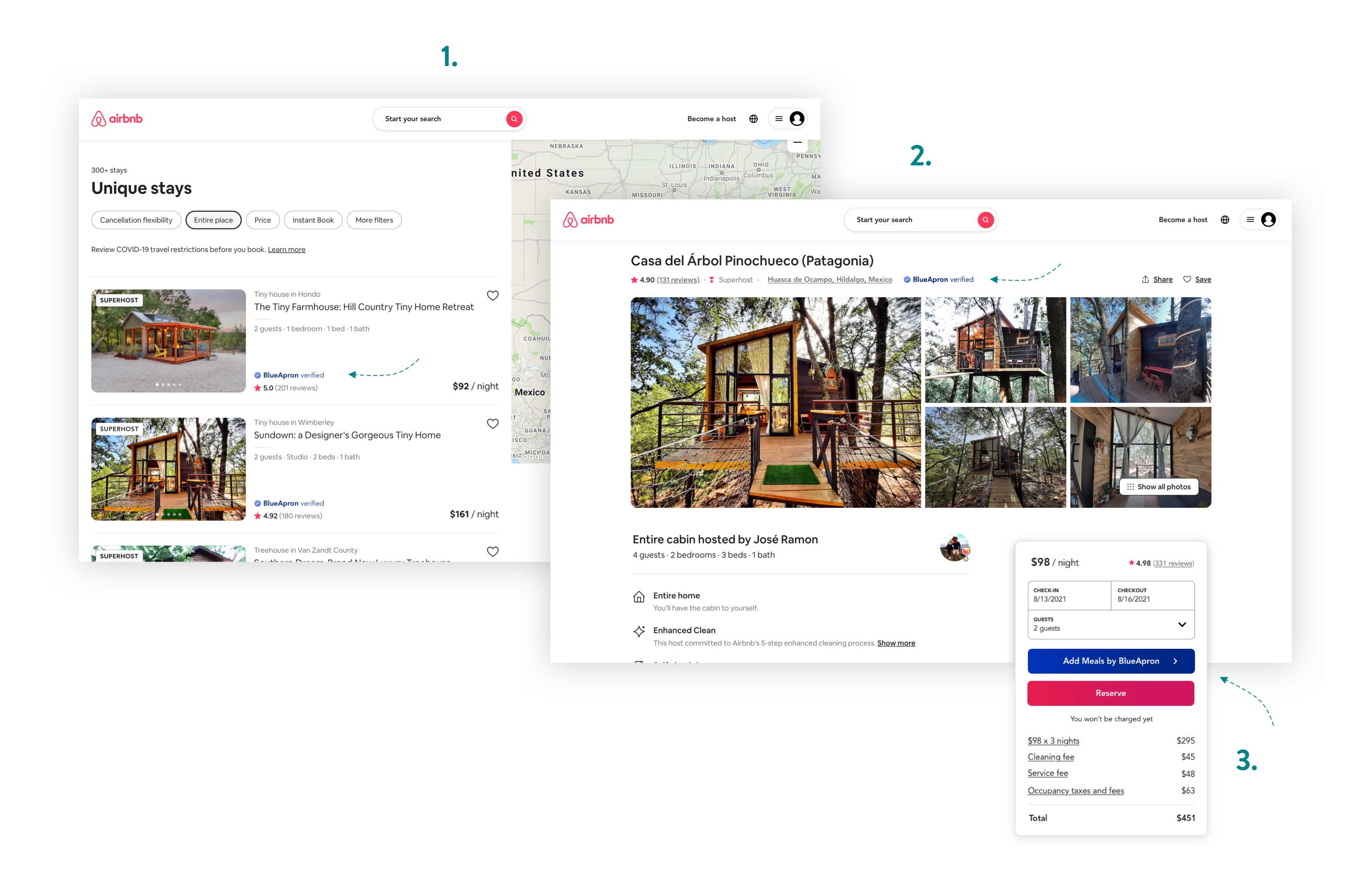
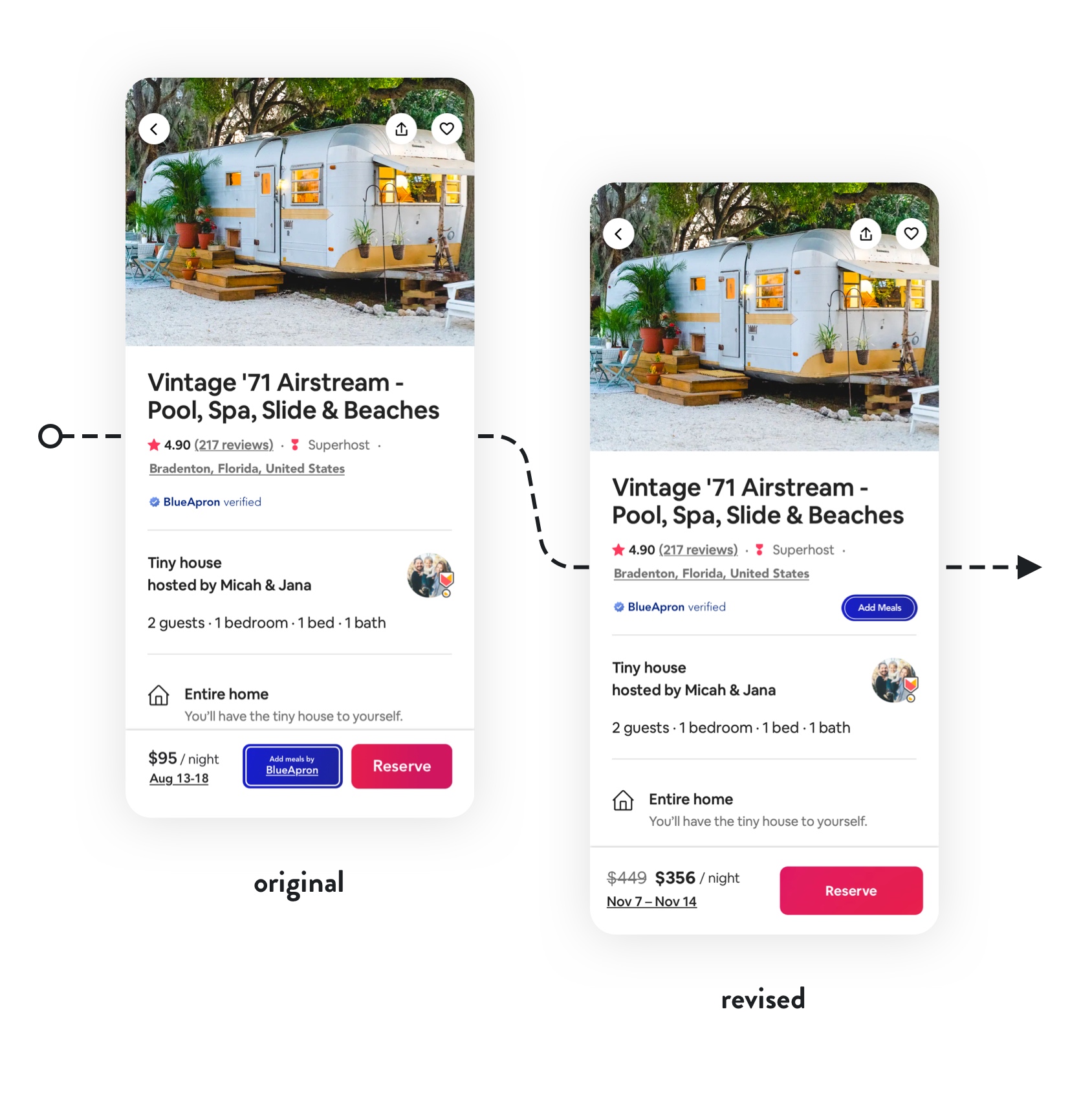
The design expands on Airbnb's existing badge system, which designates ratings and amenities. I created a custom Blue Apron branded badge, providing seamless brand integration.

A listing will display Blue Apron verification if it meets the following criteria:

  • The kitchen meets Blue Apron requirements.
    (Requires additional host onboard information.)

  • The property is located in a valid shipping region.
  • The user's selected dates provide necessary lead time for shipping to the given location.
DESIGN

Additional Screens

From the listing page, you enter a Blue Apron popup. This visually links the two brands while firmly rooting the process inside Airbnb, as opposed to opening a separate window or fullscreen menu which would be disorienting.

From the Blue Apron cart, you return to the traditional Airbnb reservation confirmation with an updated total.
Testing

Prototype

I built an animated prototype of the entire add meals flow for mobile, testing three Airbnb users. I looked for open-ended feedback centering around my two main concerns:

  • Does this process feel intuitive inside the existing Airbnb flow?
  • Is it clear that you are NOT signing up for a full Blue Apron subscription?

User testing confirmed these questions and helped uncover different perspectives on solutions I had arrived at.

Try prototype
Testing Insights
1.

CTA Hierarchy
Testing revealed that my initial placement of the "Add Meals" CTA was confusing. The fact that both buttons were of matching size and location consistently confused users.

Without the benefit of a large marketing campaign or promotion, I was concerned the new feature would be easy to miss. Simply burying the "Add Meals" CTA on Airbnb's final review/checkout page wouldn't work either, as it would create friction when searching up front for Blue Apron eligible properties.

I chose to reduce the size and location of the CTA to the Blue Apron badge section, clearly indicating to users that these were two different actions.

2.

Button Color
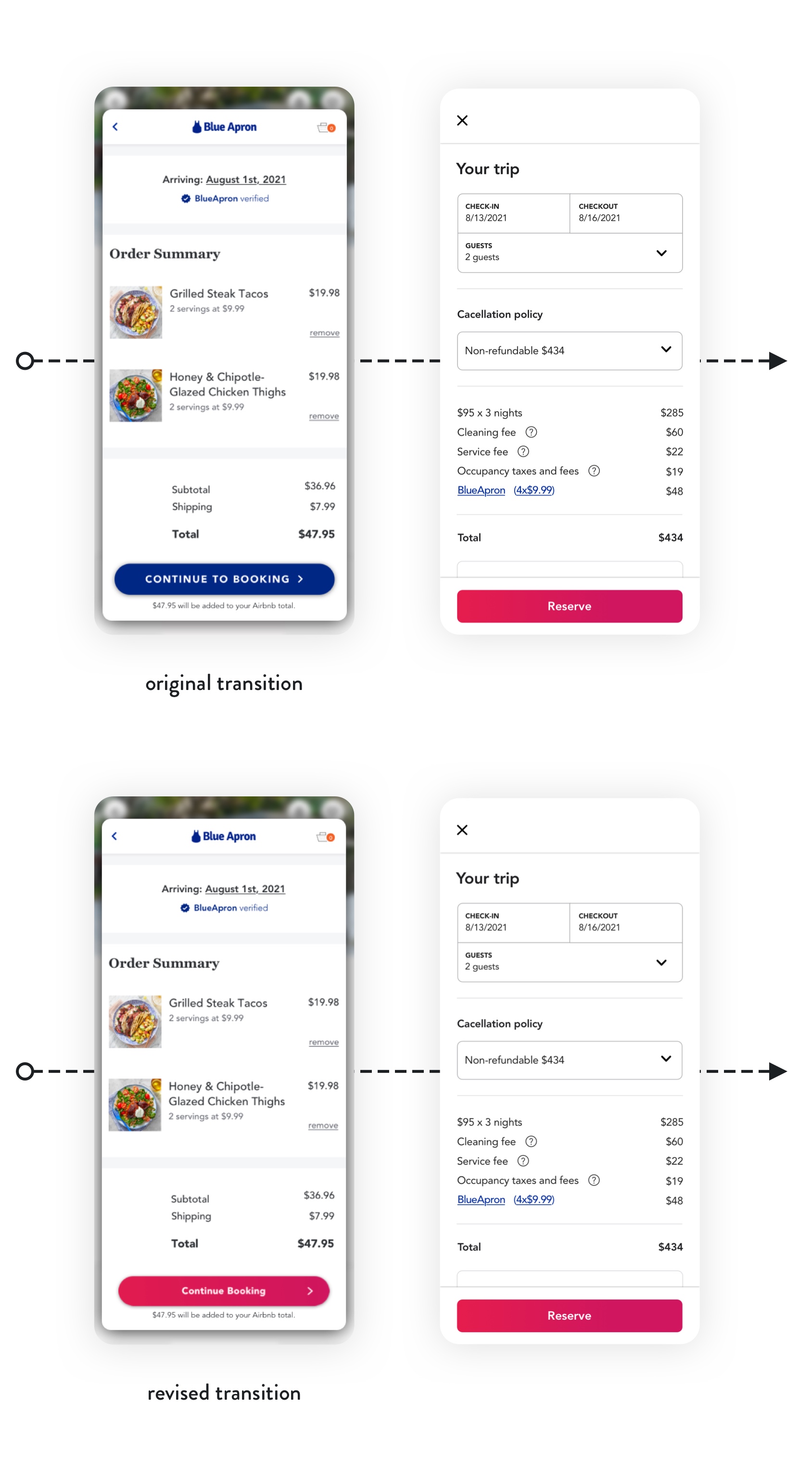
Another interesting insight came from the Blue Apron basket page, where users found the transition back to the Airbnb confirmation jarring.

At this point in an Airbnb flow, users have already entered their dates and selected a property, and the next logical step is check out.

Arguably, the strongest solution is returning to the listing page with a new total and leaving users to follow the "Reserve" CTA to finish checkout.

I found another interesting solution by simply changing the CTA color on the Blue Apron basket page. This signals to users that they are continuing to the final stage of the familiar Airbnb flow, saving a few additional steps.

Conclusion

Future

This was a great exercise of handling established brands and interaction patterns. Although the feature ultimately lived inside Airbnb, all of my choices were guided by preserving the integrity, appeal, and strength of both brands.

Idea Scrap Pile
User feedback and interviews confirmed excitement over this idea and generated a lot of additional ideas for future product features and expansion.

  • The Weekender - Breakfast Essentials - The Night In -
    Special meal kits / boxes.
  • Blue Apron Market for travel snacks and staples.
  • White Glove Service - Hosts can sign for, unpack and stock meal kits before customers arrive.
  • Blue Apron account integration for one-click forwarding of subscription boxes.
  • Blue Apron Plus- I first conceived this feature as a two-tiered system to distinguish really spectacular or professional grade kitchens.

Other projects