
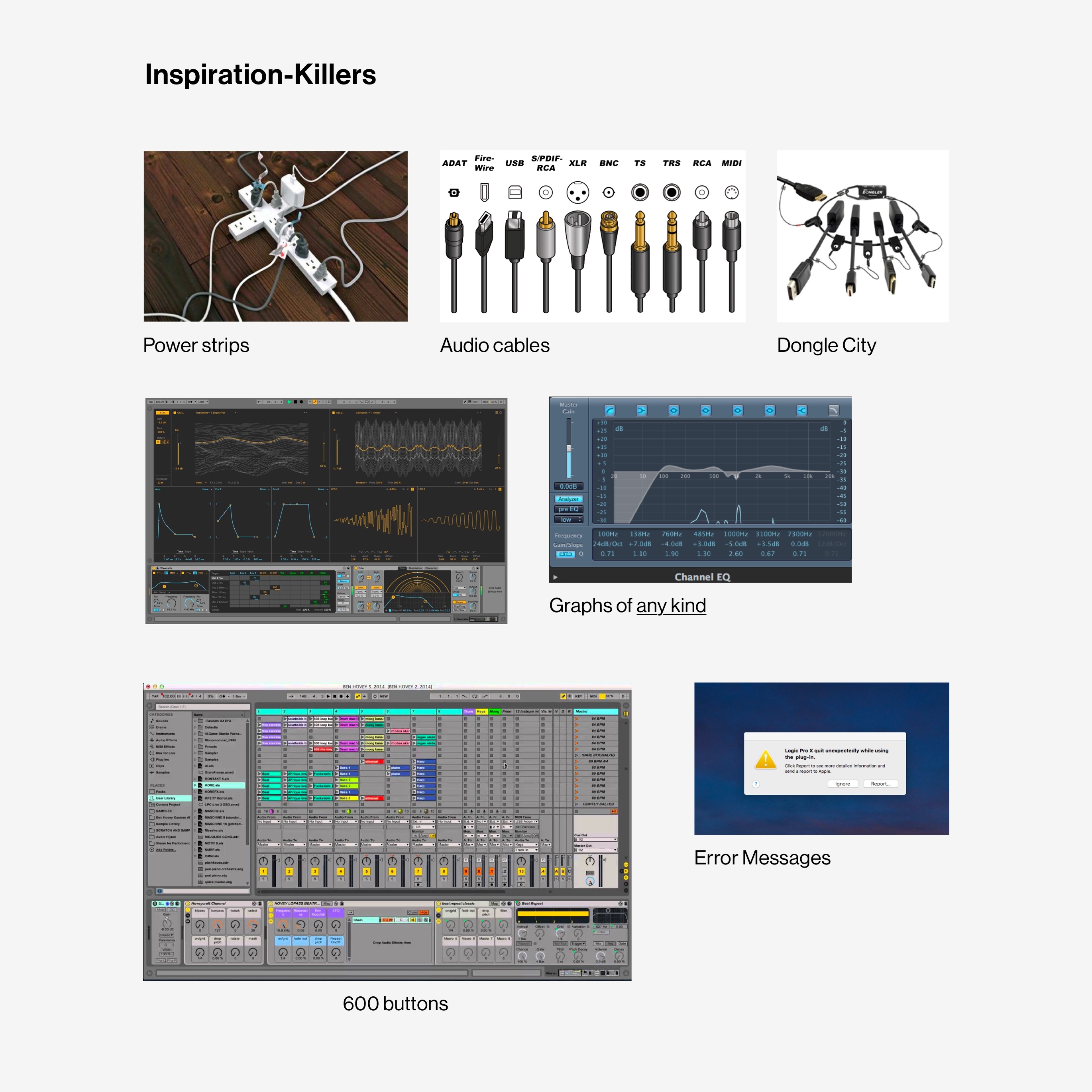
Modern music software - digital audio workstations (DAWs) - have collapsed multiple creation stages into one function known as producing.
The more technically demanding recording functions inevitably dominate the space by way of screen real estate and linear workflows.
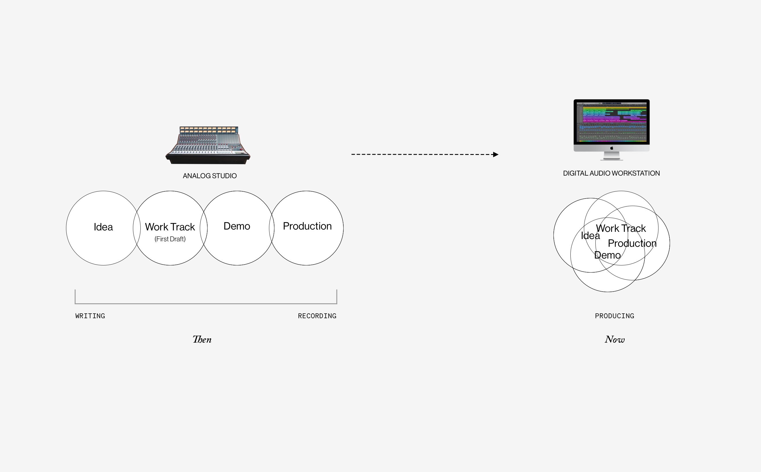
Existing mobile music apps are a replica of desktop audio workstations (DAWs), which in turn replicate old analog studio setups. This tends to compress all stages of making music into a single technical process which is not beneficial for writing.
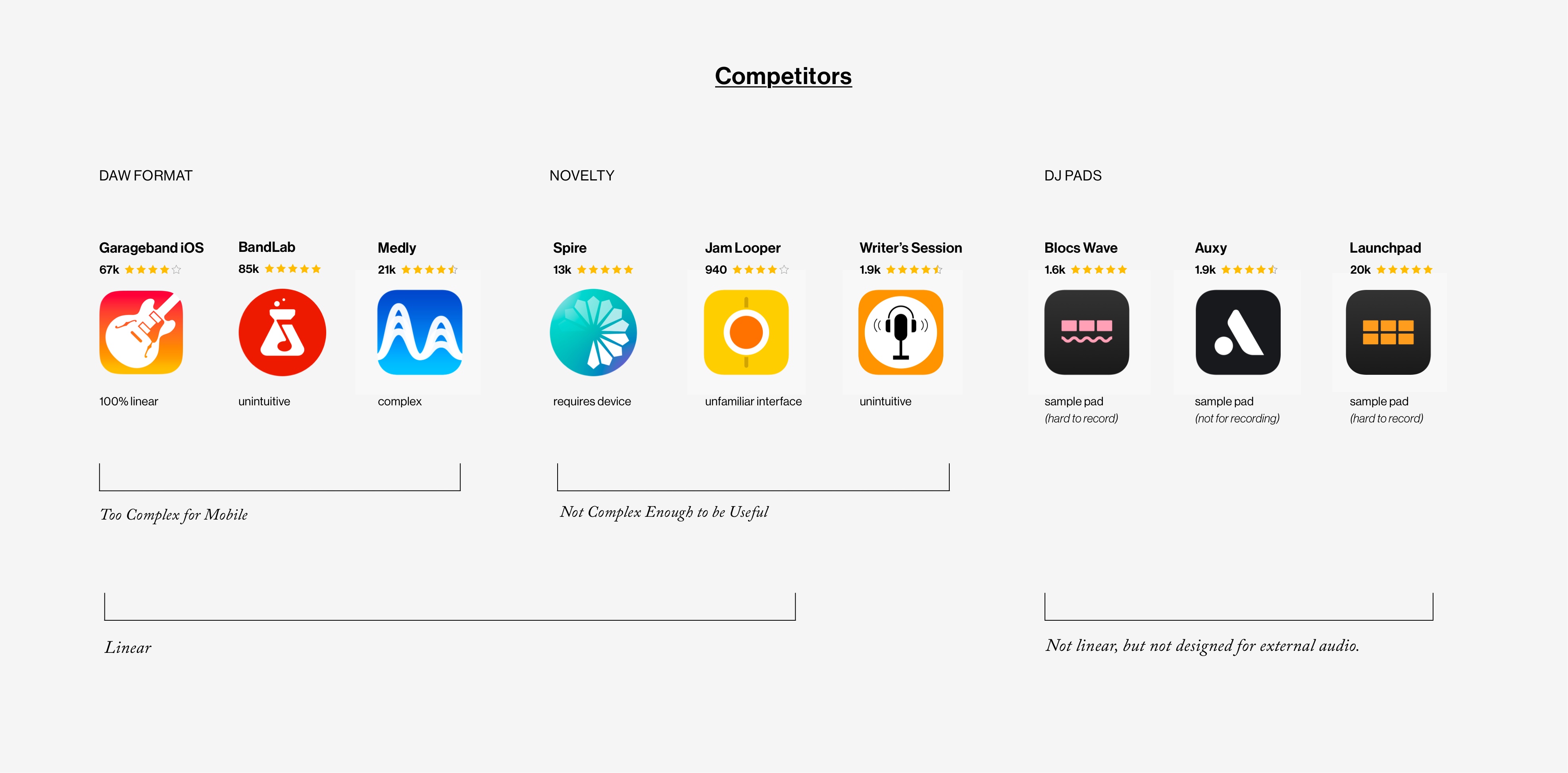
To illustrate the above issue and further investigate market competitors, I downloaded and tested each of these leading mobile music apps.
Competitors tend to fall into 2 main categories-
1) DAW Format -which is too complex to be useful in the mobile context.
2) Novely - Either not designed to stand alone, or not complex enough to be useful.
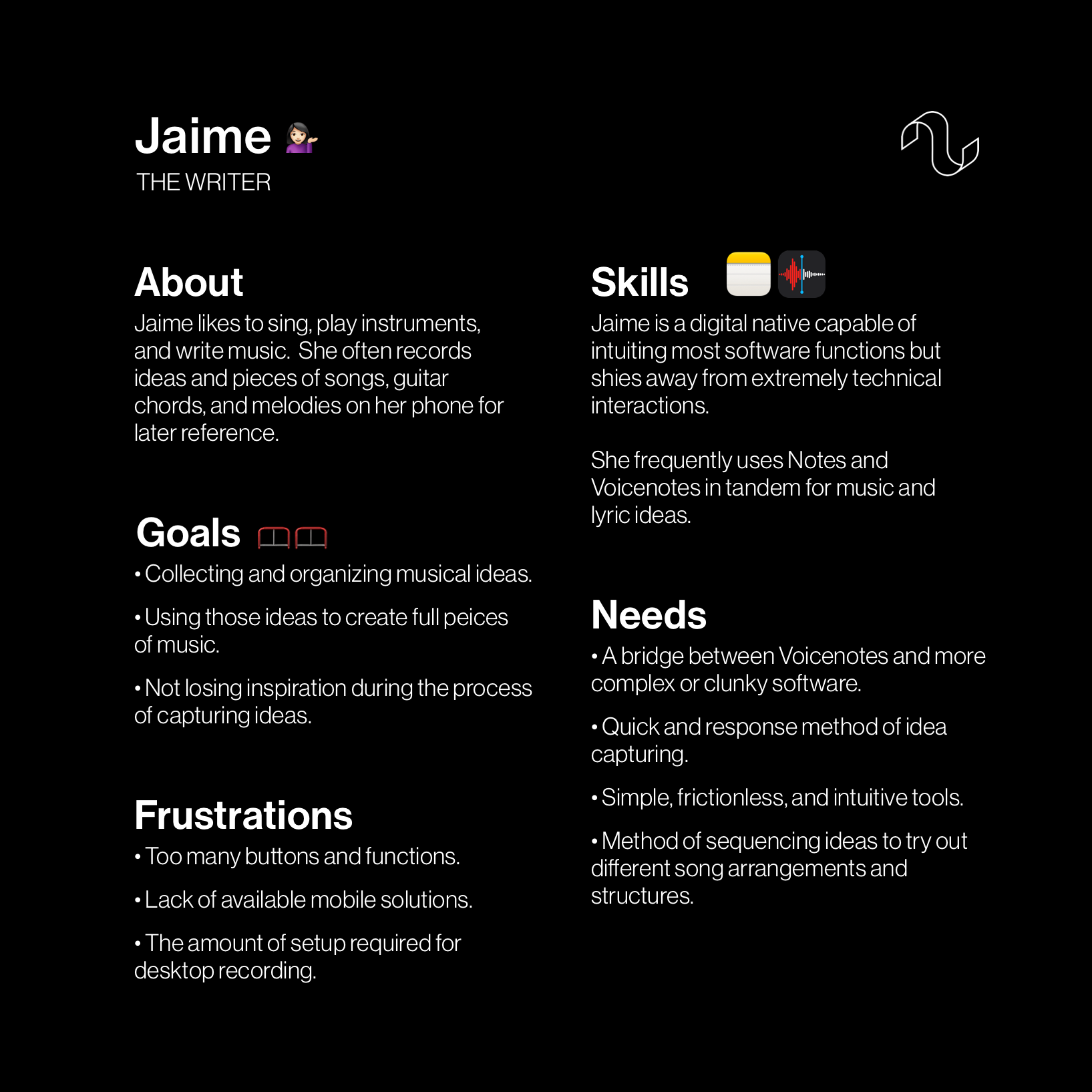
Using a method of Contextual Inquiry, I interviewed 4 SME's about their preferences, habits, and hangups with the music-making process.
I approach these interviews with a structured yet informal method best suited for an open-ended line of questioning into hard-to-quantify topics.
Criteria
Insights
Based on the information and perspectives gathered, I synthesized a persona for the broadest user base.
Jaime is is a digital native capable of intuiting most software, but shies away from extremely technical interactions. She is often frustrated by software that puts complexity at the forefront.

I began by sketching to get a general feel for the shape the product may take and distill possible functions and interactions down to necessity, followed by many iterations of wireframes.
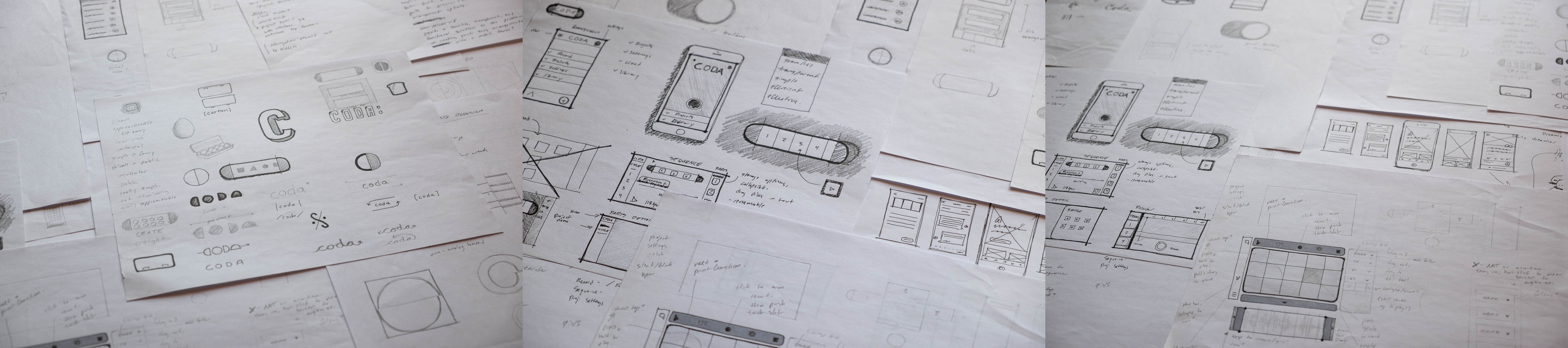
After the generation of many ideas and options, I recognized the need for a focused information logic to help bring the design into clearer organization and simplicity.
Function Map
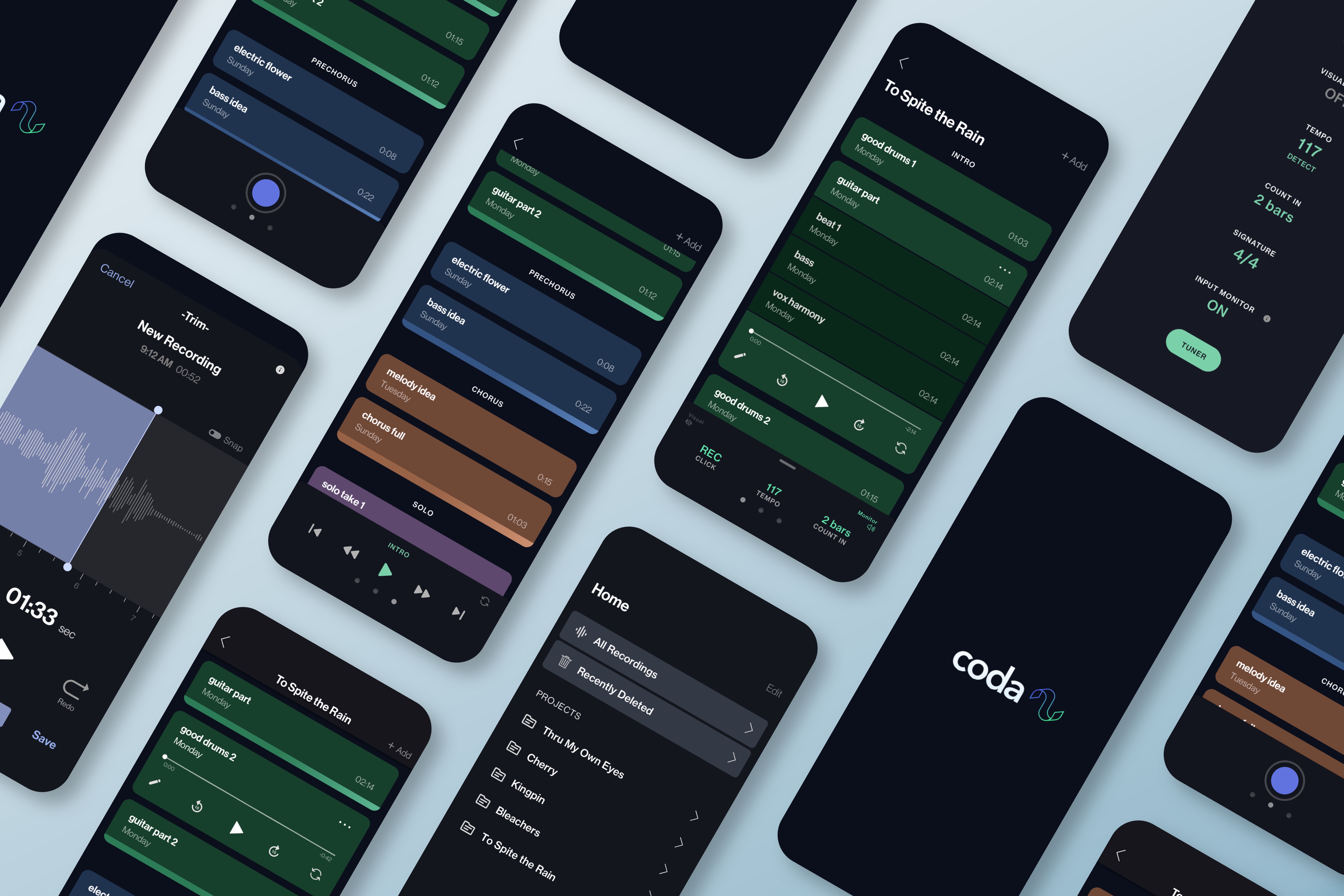
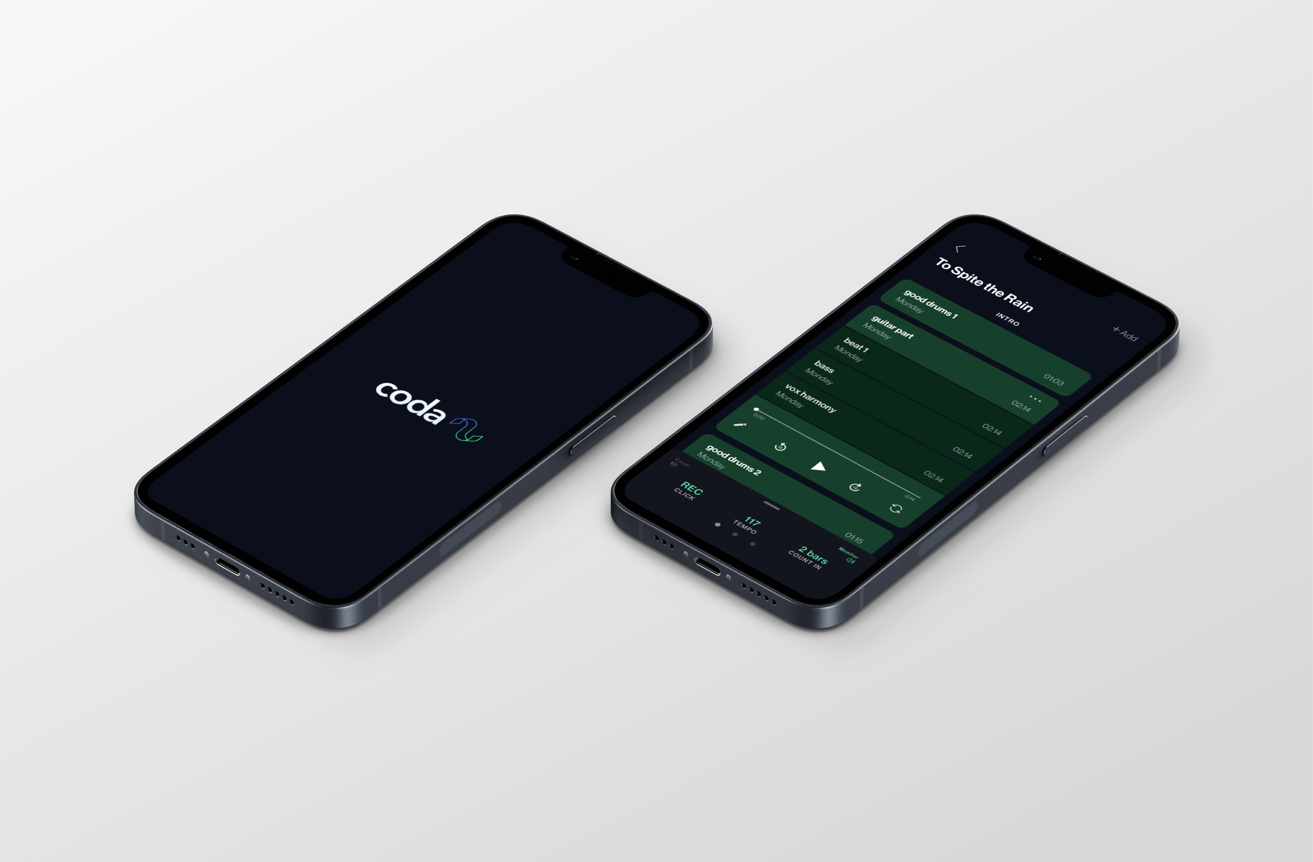
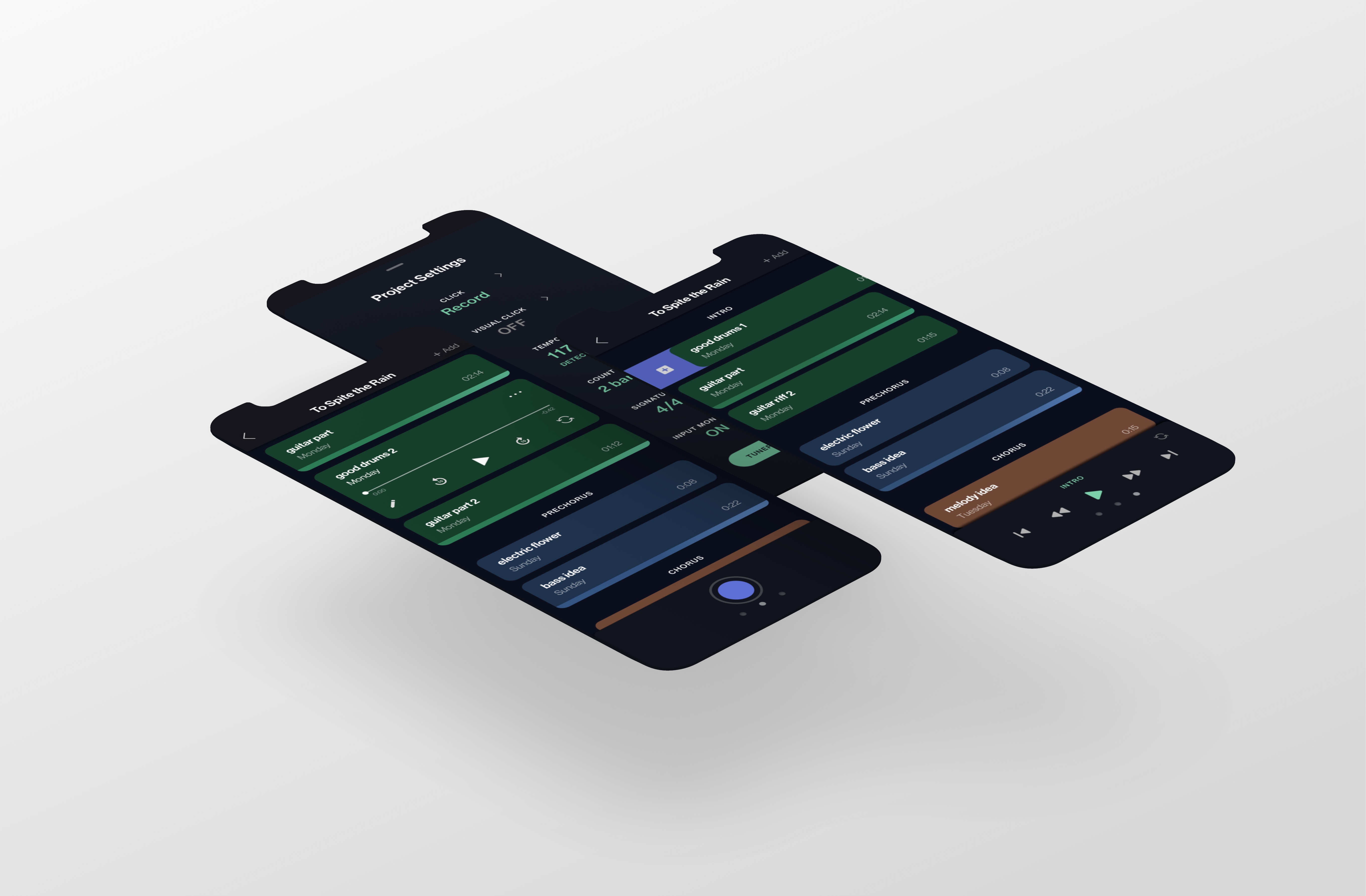
The design centers around one main screen - the Project Screen. All functionality is overlaid inside, made possible by a swipe bar containing additional features.
With the swipe bar, you can quickly change settings or enable recording without ever losing your place. This helps conserve the feeling of simplicity and limits the amount of overall functions/buttons.
Furthermore, a single screen provides the feel of a workstation and avoids the mistake many mobile programs make in having separate screens for every feature.
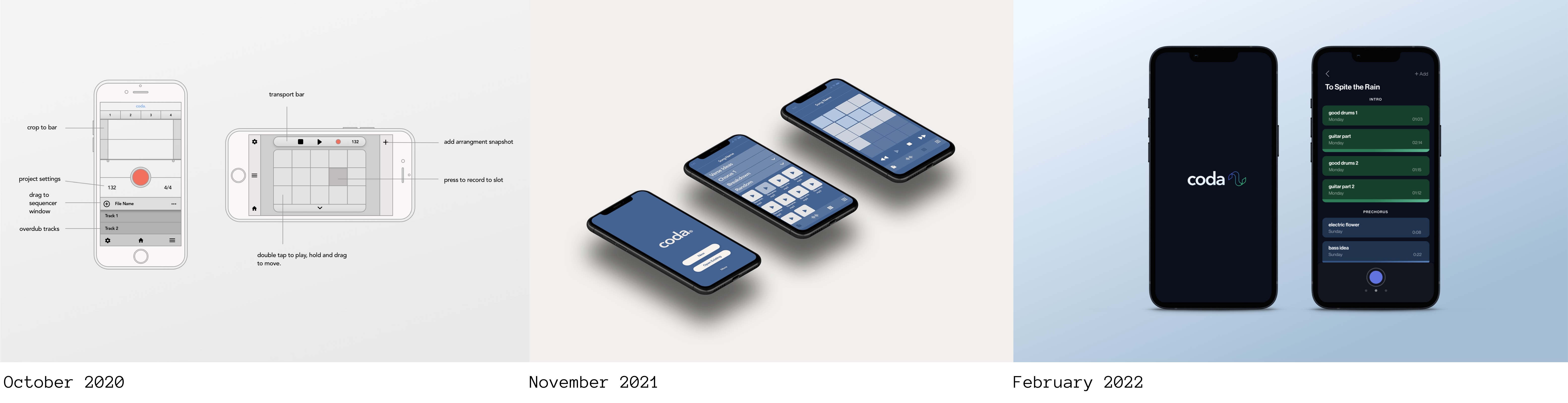
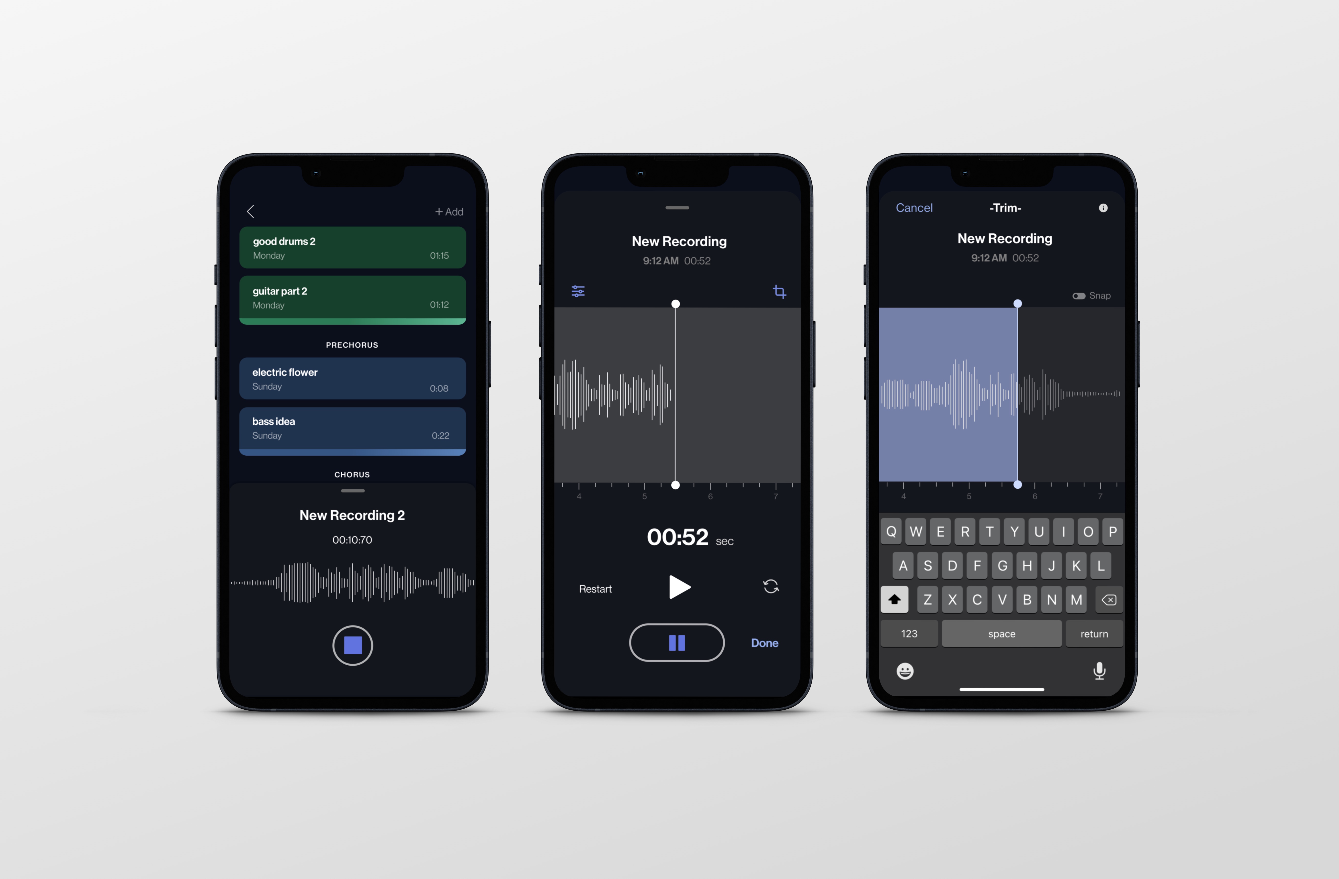
Task Flow - Recording
The recording flow is instantly accessible on start for quickly capturing ideas. After an initial download and setup, the recording-ready project screen will be the first to open.
Each necessary decision - record, redo, edit, or overdub - is configured as part of the flow instead of as separate buttons on the home screen.
How might we accommodate the technical functions of recording without prioritizing them? This question served to guide the design of several unique patterns that allow for full functionality without a maze of endless screens and setup.
Single Screen Workspace
In order for the app to feel intuitive, I chose to avoid a maze of screens for each task. Each project has one main screen from where all interaction is based. This challenge of simplification is not just in appearance, but in using as few steps as possible to complete each necessary task.
Track Appearance & Behaviors
It took many iterations to discover how best a track should be visually represented- in default state, collapsed, expanded, as a multi-track, during playback, and revealing the functionality of swiping.
Command Swipe
The Command Bar swipe pattern conceals necessary utility functions while keeping them present and easily accessible, as opposed to buried in menus or on separate screens.
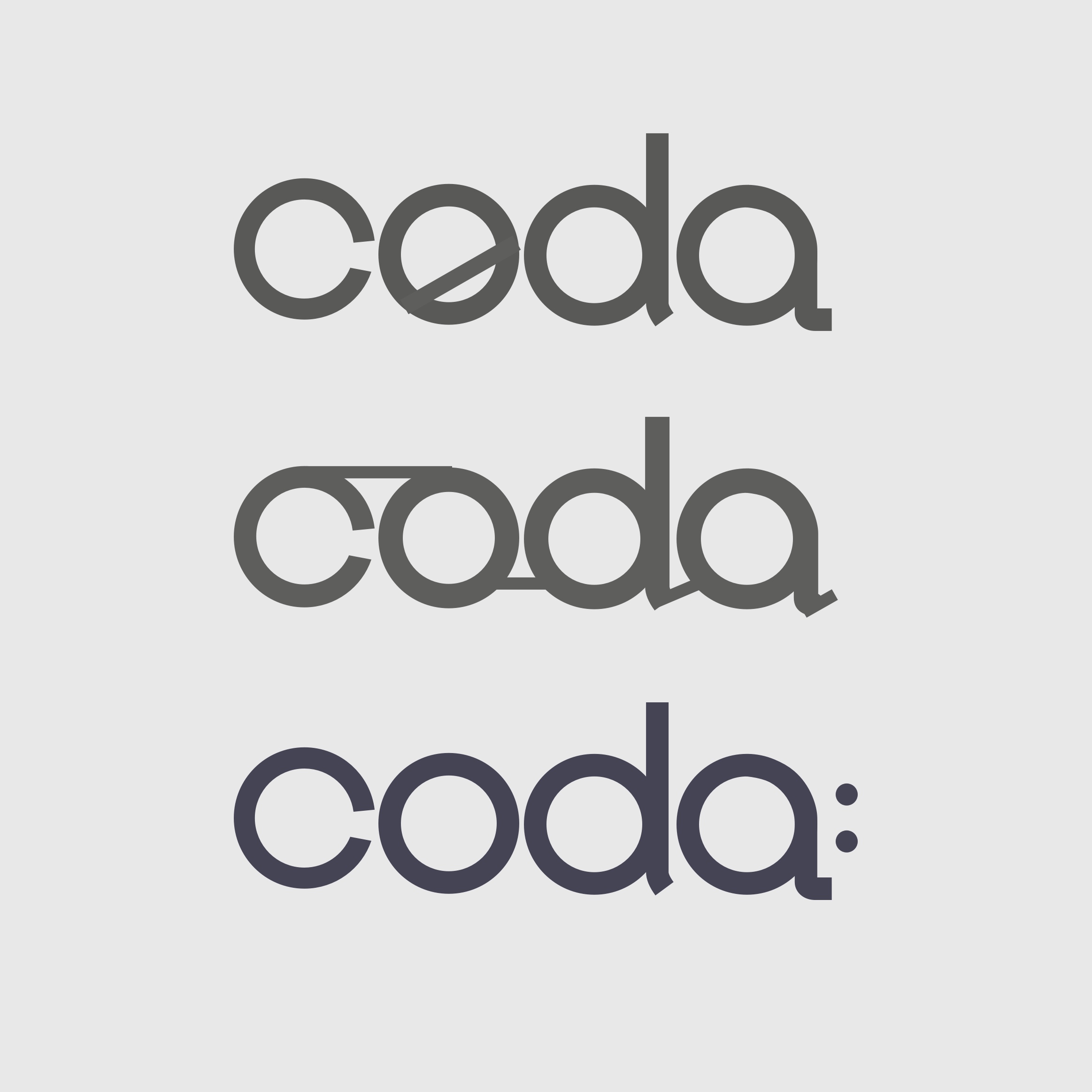
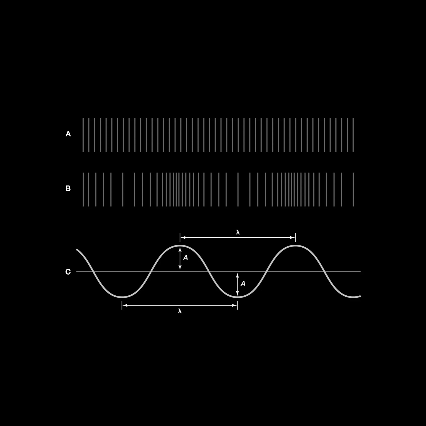
The look and feel is meant to be fun, familiar, approachable, simple, and effective. I began with a lot of design ideas, but things really began to click when I started creating waveform-inspired variations.
I built a fully animated prototype for testing with my original SME interview subjects. I focused on illustrating the main recording flow as well as the unique patterns and behaviors to ensure the overall look, feel, and flow of the app were seamless.
View PrototypeView instructions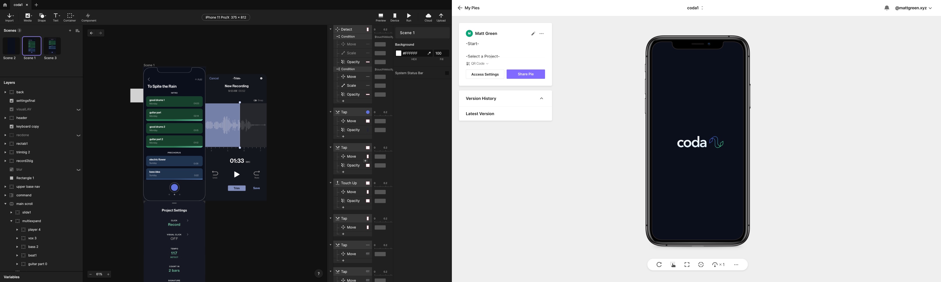
Three main questions guided the testing phase with users.
1) Does this app feel familiar and intuitive?
2) Do you see any obvious hindrances or pain points?
3) Could any function be improved in its visual representation?
Users quickly recognized the underlying logic of the app and were delighted by the way common problems in music software had been addressed.
I most enjoyed the interview and testing of this product. Open dialogue with users is the quickest road to improvement, and I love validating innovative features with potential users.
The ultimate challenge of this project was simplification. If you are familiar with recording software, you know how complicated and intimidating it can be. Based on user feedback, I've designed a product that feels intuitive and approachable while retaining a sophisticated level of functionality.
Additional Personas
I plan to expand the potential user base by interviewing additional SME's in parallel specializations to create new personas.
Next Steps
As a founding designer I am working with a cross functional team that includes developers and marketing experts to create a full beta release and attract additional funding. We are working toward a Summer 2022 Y - Combinator application.